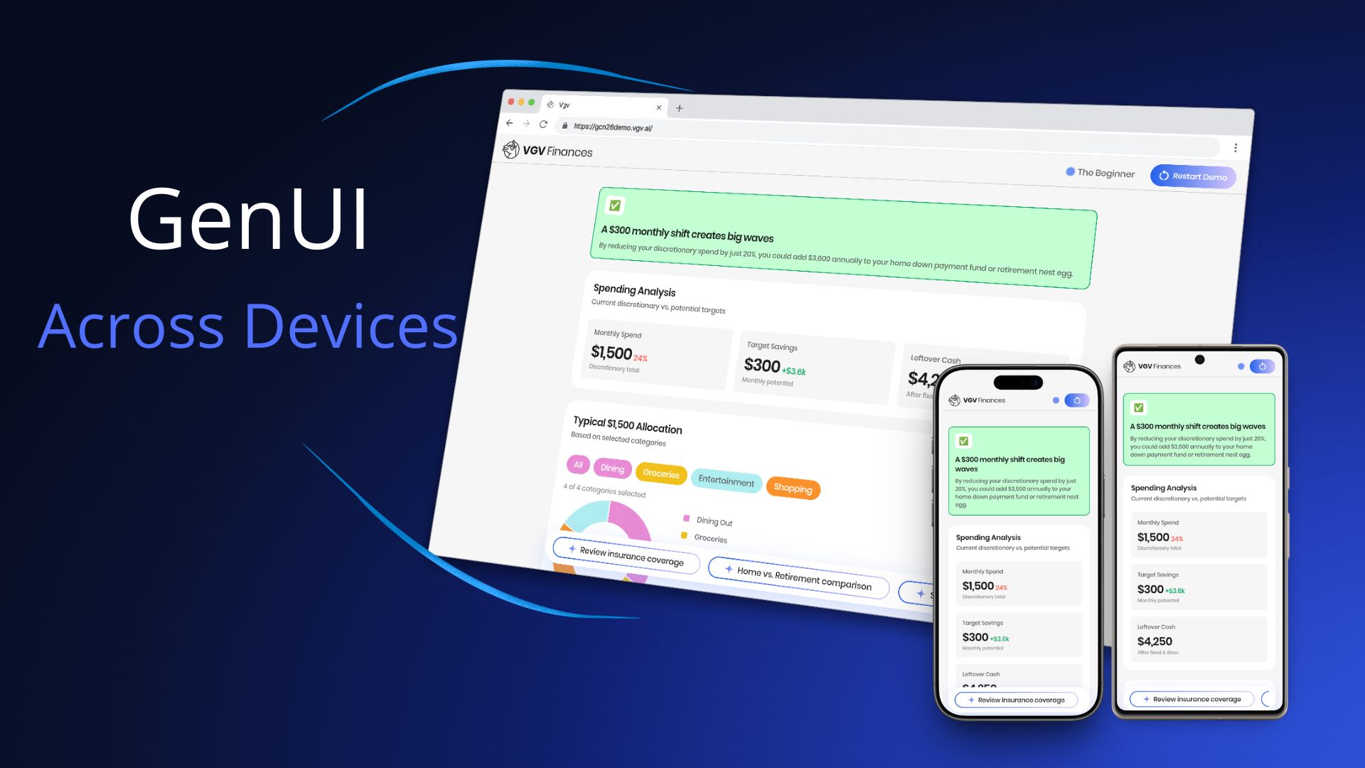
For Google Cloud Next 2026, we built the Very Good Life Goal Simulator — a multi-platform demo showcasing Firebase AI and GenUI in a personal-finance dashboard. The app runs on Android and Web from a single Flutter codebase, and uses Generative UI to render AI responses as interactive widgets in real time: sliders, charts, filter chips, radio cards, and more.
That last part is where the cross-device question gets interesting. When an LLM is composing your UI on the fly, how do you make sure those assembled surfaces look right on a 6-inch phone and a 27-inch desktop monitor?
Here’s what we learned.
What GenUI Changes About Cross-Device Work
With conventional Flutter development, cross-device layout is a bounded problem: you know the shape of every screen, and you design for each form factor.
With GenUI, the LLM decides which widgets to render and how to compose them. Your CatalogItem definitions — the custom widget schemas you register — tell the model what it can use. But within those boundaries, the model chooses. A response might place three filter chips next to a sparkline chart, or surface a slider below a data table.
The cross-device question is therefore not just “how do our screens adapt?” It’s “how do AI-assembled surfaces adapt — reliably, across layouts we can’t fully predict?”
What We Tried First
Before landing on our final approach, we ran a couple of spikes where we gave the LLM explicit device context — the screen size and the target platform (web or Android) — and let it decide which components to render based on that information.
The results were interesting: the LLM was actually quite good at choosing the right components. But it didn’t produce better results than responsive design would. Giving the model device information turned out not to be the advantage we expected, and it introduced two new problems.
Option 1: device-specific catalog items. One approach was to define separate mobile and desktop variants of the same widget — SparklineCard_mobile and SparklineCard_desktop, for example — and instruct the LLM to pick the right one. The model could do this reasonably well, but the cost was a catalog that grew rapidly. A larger catalog means a larger system prompt, which eats into your context window and makes the prompt harder to maintain.
Option 2: serve a different catalog per breakpoint. The other option was to swap the entire catalog at the repository level based on the current breakpoint. This avoided the bloated catalog problem, but introduced a worse one: it can’t handle window resizing. If a user loads the app on a mobile breakpoint and then resizes their browser to desktop width, the LLM has already chosen mobile components for that surface — and it has no way to respond to the resize. The UI is stuck.
That last point is important: resizing is something you simply cannot solve with only an LLM. A user can change their breakpoint at any time, and the model can’t react to that. Flutter’s constraint system can — because it re-evaluates layout on every build. That realization is what pushed us toward putting responsive behavior in the widgets themselves rather than in the model.
How We Solved It
The key insight was understanding the division of responsibilities: the LLM decides which widget to show, what content to populate it with, and at what size — but the widget itself owns its internal layout and rendering.
Before diving into the problems we hit, one practical note on workflow: we always tested catalog items in the dev menu before involving the LLM. The app includes a component catalog where you can render each widget at different sizes in isolation. Only once a widget looked right across breakpoints did we test it end-to-end with the LLM. That two-step loop made iteration significantly faster.
Problem 1: widgets were getting crushed on mobile
The widgets didn’t have responsive constraints, so on a phone screen they had nowhere to go. Charts and cards that looked great on a wide desktop viewport were too small to be usable on mobile.
The fix was to give each catalog item explicit mobile and desktop size constraints. For example, the BarChart defines separate barWidthMobile (18px) and barWidthDesktop (46px) values with corresponding minimums, and uses LayoutBuilder with .clamp(minBarWidth, maxBarWidth) to compute the final bar width at runtime:
final maxBarWidth = responsiveValue(
  context,
  mobile: _BarChartDimensions.barWidthMobile,    // 18px
  desktop: _BarChartDimensions.barWidthDesktop,  // 46px
);
final minBarWidth = responsiveValue(
  context,
  mobile: _BarChartDimensions.barWidthMinMobile,    // 6px
  desktop: _BarChartDimensions.barWidthMinDesktop,  // 8px
);
final barWidth = computed.clamp(minBarWidth, maxBarWidth);
Problem 2: the LLM was filling widgets with too much content
Even after fixing the size constraints, content was overflowing — especially on mobile, where there’s simply less space for text. The LLM had no awareness of how much room was available, so it filled widgets as if it were always rendering on a wide desktop screen. A SectionHeader subtitle that ran three sentences broke the visual rhythm of a question screen. A description field with too much text wrapped awkwardly inside a compact card. The widget rendered fine — the content didn’t.
The fix was to give the LLM explicit content rules in the system prompt alongside the widget schemas — capping SectionHeader subtitles to 1-2 sentences, and defining layout containers with explicit max widths (QuestionContainer at 650px, SummaryContainer at 1000px). Once we gave the LLM a defined structure with clear content expectations per slot, the overflow problems disappeared.
Problem 3: the LLM wasn’t using widgets as intended
Even with size constraints and content rules in place, we found cases where the LLM used a widget correctly — but not in the way it was designed to work. The SparklineCard is a good example: the LLM was rendering a single card instead of the minimum two required for the component to make visual sense, and the container wasn’t expanding to full width.
The fix wasn’t in the widget code — it was in the catalog rules. We updated the SparklineCard description in finance_catalog.dart to be explicit about usage:
- Before: “Use the SparklineCard widget to display a financial category with its amount and a trend sparkline.”
- After: “Use the SparklineCard widget to display financial categories, each with an amount and a trend sparkline — arranged in a horizontal row on desktop or stacked vertically on mobile. Always provide at least 2 cards in the
cardsarray.”
That one-line change was enough — and notice what else snuck in: “arranged in a horizontal row on desktop or stacked vertically on mobile.” That’s a responsive layout rule, delivered not in code but in the catalog description. The LLM now knows how the widget should behave across devices, without any changes to the widget itself. The catalog description is the LLM’s only source of truth for how to use a widget — if the behavior isn’t described there, the model will guess. The more precise the description, the more predictable the output across every device.
Prompt engineering and widget constraints are two sides of the same coin. Constraints prevent widgets from rendering outside their safe range. Prompt rules prevent content from overflowing the space that remains.
The Architecture That Made It Cheap to Iterate
We updated catalog item constraints several times before landing on the right values. That iteration was fast because of one architectural decision: all GenUI complexity lives inside SimulatorRepository, behind a two-method API (startConversation() and sendMessage()). The bloc and UI layers never import GenUI directly.
When we needed to tighten a constraint or adjust a prompt rule, we changed only the catalog or the PromptBuilder — no state management, no view code touched. Clean boundaries made the cross-device tuning loop fast.
Key Learnings
The LLM decides content and size; your widgets own their internal layout. The model’s job is to choose which widget to show, what content to populate it with, and at what size. How that widget renders that content is Flutter’s job. Keep those responsibilities separate.
Mobile and desktop constraints are not optional. A GenUI surface can be rendered on any device at any width. Define explicit min/max values per breakpoint for every catalog item, and make them tight enough to always look good.
Prompt rules and code constraints work together. Use the system prompt to control content density — short subtitles, focused questions, one idea per widget. Use code constraints to control size boundaries. Neither is sufficient alone.
GenUI is a new way to compose UI, but it renders Flutter widgets — and Flutter widgets live in a constraint system. The principles that have always made Flutter multi-platform didn’t change. Responsive design is still the right mental model; we just had to apply it in a new place.
Try It Yourself
The Very Good Life Goal Simulator is open source. Explore the full implementation — catalog items, size constraints, the repository boundary, and the prompt structure — in the GitHub repository, and try the live app at gcn26demo.vgv.ai.