On this page
We’ve come a long way since our first day as Very Good Ventures. What began as an ongoing stewardship of Hamilton, the first commercial app built with Flutter outside of Google, has now grown into a consultancy that has advised more than 25 companies about how to build scalable Flutter applications. Our team is now approaching 40 teammates with offices in Chicago, Stamford, Poland, Madrid, and Rotterdam. We’ve written over 60 blogs and created open source packages that have reached thousands of stars on GitHub.
Over time, our team and methods have evolved and the scale and sophistication of our services has grown tremendously. As we grow and mature, we want our brand to evolve too. So we embarked on a brand refresh — not to overwrite what we’ve done so far or establish a new identity, but to better reflect who we are today and support us into the future. This blog details the updated Very Good Ventures brand marks and the thinking behind the changes.
Updated unicorn mascot
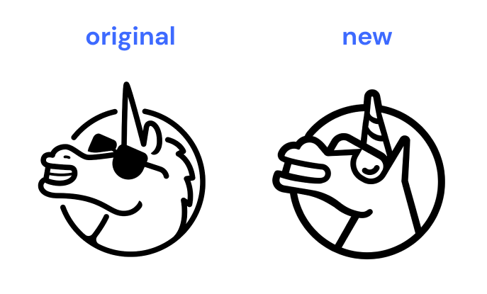
You may know us best for our mascot: a unicorn wearing sunglasses. It was obvious to us the icon resonated with our community, so we did not want to lose the familiar unicorn mark. However, we looked for ways to update and modernize it without losing the spirit of the original.
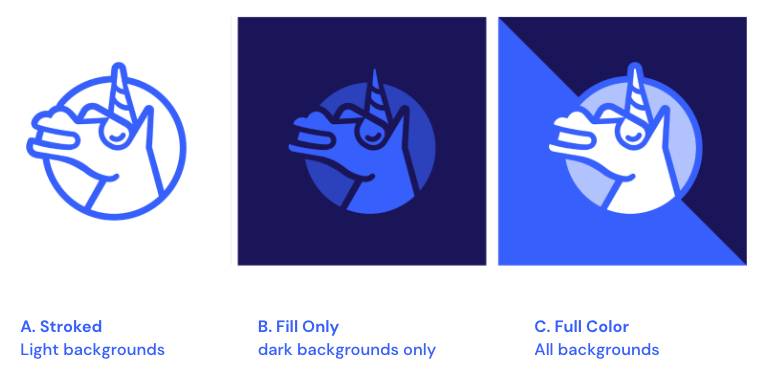
The original logo was drawn by Daviher Laredo and we fell in love with it at first sight. However, the breaks in lines of the circle and the mixing of strokes and fills made the logo difficult to use in some settings. We couldn’t add a fill to the background or change the color of the lines without changing the color of the glasses.

The new unicorn mark evokes the same positive and playful feeling , but is simpler and better constructed as an asset. We’ve significantly reduced the visual complexity which helps the logo to maintain fidelity at smaller resolutions, which is important on digital platforms. Additionally, its tighter composition allows us to modify it in ways that aren’t possible with the old logo. For instance, we can add background colors or textures to the circle without breaking the form.
The new unicorn also has more of an upward tilt and forward lean, to further emphasize the positivity and ambition of our team, as it’s leaning forward more than falling back.
Another subtle change is that we’ve removed the company name from being wrapped around the circular path. From now on, we’ll only lock up the word mark separately. This gave our designers a lot more freedom as they didn’t need to maintain a visual spacing that supported the words.
Perhaps the thing we’re most excited about is the fact that our logo can now exist in a variety of treatments to best suit the context. For instance, we found that a “stroke only” version tended to lose its punch on dark backgrounds. So now we also have “fill only” and “full color” variants that allow us to adjust the stroke and fills to create cool effects and make our brand really pop.
In the end, the new version also feels like it could be a fun app icon, which feels right at home with our mobile development work.
Responsive wordmark
The original Very Good Ventures wordmark was a fun hand lettering element, but it is something that we’ve had a hard time using in practice. It didn’t really pair in an obvious way with the unicorn mark, and we needed a better solution.
Since “Very Good Ventures” is three words and a bit lengthy, it also presents some challenges fitting it into certain spaces.
As Flutter developers, we are familiar with building responsive apps that look very good on any screen. So, we had the idea for our new wordmark to be flexible to scale through three variants that are responsive and can work for various constraints. As the wordmark is collapsed down to the three-line variant, the shorthand “VGV” is revealed.
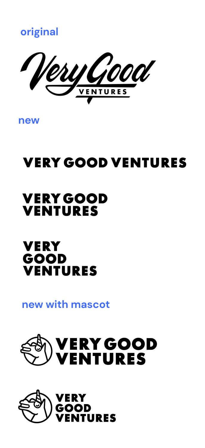
“VGV” mark
Increasingly we’ve been using the shorthand “VGV”, both internally and externally, so we knew we needed to address it in some way. While our primary brand will remain “Very Good Ventures”, our new wordmark style supports the abbreviation. In informal and known contexts, we’ll use this wordmark as another way to connect with our brand.

“Very Good” stamp
As our team grows, we’re finding we’re leaving our mark on many things and in many ways. Since we can’t always put our brand on something, we wanted to find a way to show affiliation without ownership. So, we also added some stamps into the mix for projects, partnerships, and other ventures that meet our Very Good standards. While we don’t anticipate that this will become a main logo for us, we like how this gives us the ability to apply our “stamp of approval” beyond VGV — and we think it’ll make some pretty sweet merch.

History of VGV brand
Back in 2018 we set out to create a brand that made people feel good. We wanted a company name and logo that you could help but smile when you see it, but that felt inspired and professional.
We called the company Very Good Ventures because, well, we feel we are “very good.” But you can always be better — so being the “best” is not a state but a never-ending goal.
When considering an icon, our founder (who has two daughters) found inspiration in the juxtaposition of the many plush unicorn stuffies in his house and the idea that a unicorn is a billion-dollar company. What better icon for a serious company with big ambitions that doesn’t take itself too seriously.
We’re happy that over the past few years, the VGV brand has caught on and resonated well with our team, our communities, and our clients. The updated brand is an exciting next step in our evolution.
What’s next
You’ll start seeing our new branding everywhere Very Good Ventures can be found, including our website, open source packages, social media, and more.
Stay tuned for some Very Good Merch, coming soon to the web near you.