On December 4th, 2018, Flutter Live ’18 showed the world the first major glimpse of the exciting vision for Flutter. Not only did Flutter achieve v1.0, but we saw a host of amazing new tools as well as Flutter Desktop Embedding and Hummingbird in action.
One of the most incredible moments, in a keynote filled with plenty, was when it was revealed that the entire keynote presentation was itself running in a Flutter app! For our team at Very Good Ventures, this moment was also also incredibly nerve-wracking.
You see, we built the Flutter Slides app used in the keynote in close partnership with Tim Sneath and the incredible design team at Google. This moment was make-or-break, and as is typical with our Flutter experience, everything went beautifully.
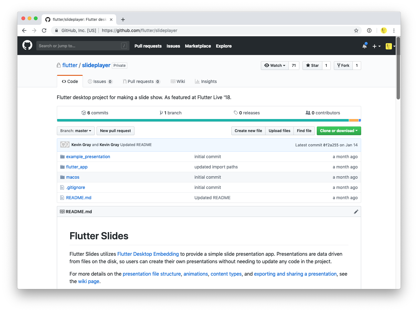 Flutter Slides is now open source
We are incredibly proud of what we accomplished with the Flutter team, and we hope that members of the Flutter community can use this library as a jumping off point to learn about using Flutter for desktop. To that end, we’d like to tell you a little more about Flutter Desktop Embedding and our experience building the app for Flutter Live ‘18.
What is Flutter Desktop Embedding?
Flutter Desktop Embedding is an implementation of Flutter that enables Flutter apps to run on Windows, macOS, and Linux. It’s still very early in its lifecycle, but its promise is extraordinary. It means that a team of developers using Flutter to build for iOS and Android, can also build apps for the major desktop platforms — without learning a new language, without a different set of build tools, and with reusable code.
“This is amazing. I just ran BetaBubs, and it just…worked. I guess we’re macOS developers now too.” - Kevin Gray of Very Good Ventures
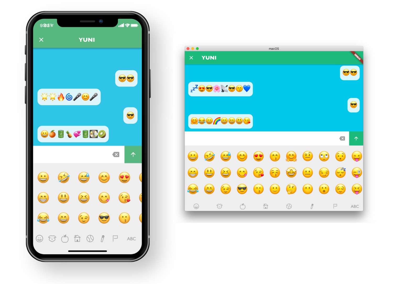 Our emoji app for kids, BetaBubs Play Emojis, worked on macOS with virtually no code changes!
The first time Kevin, a lead Flutter engineer at Very Good Ventures, set up Flutter Desktop Embedding and ran our BetaBubs app as a Mac app, he blurted out “This is amazing. I just ran BetaBubs, and it just…worked. I guess we’re macOS developers now too.”
It was an incredible moment as our team realized that we could now develop for a whole new platform — the desktop! Just like that, our years spent becoming experts in Flutter, a nascent multi-platform development framework we were using for mobile apps, had produced a whole new world of opportunities.
In retrospect, we always found it interesting that Google always described Flutter as multi-platform rather than cross-platform. Our team was lucky enough to find and love Flutter from its very early days.
We started using Flutter when it was still in alpha, and we were fortunate to develop the Hamilton app, which went on to become a flagship Flutter product. From the earliest days, Flutter was always multi-platform. Now we all can clearly understand that choice of words — Flutter’s vision is a single unified UI platform, not just for iOS and Android apps, but for anywhere you want to paint pixels — whether for Mac, Windows, Raspberry Pi, ChromeOS, and even web.
The Flutter Slides App for Flutter Live‘18
When we set out to build the Flutter Slides app, we had basically no constraints or defined scope. It simply need to work, had to be easily updated as content creators finished their slides, needed to showcase what Flutter can really do, and it could not possibly crash (Oof, can you imagine 😳).
Minimum Viable Slides
Our first task was figuring out the minimum feature set required to create an effective slides app. By the time we started, we had less than a month until the big day, so we had to be frugal with our choices.
First, we need to be able to layout content on a slide. Since the window of desktop app can be resized, we needed a layout system that would be relative to the window and scale content up and down accordingly (create a slide in Google Slides and resize your window and watch how the content behaves to see what we mean). On mobile, content doesn’t necessarily resize so that it looks the same at all scales, so this was a new challenge.
Next, we needed to be able to move forwards and backwards between slides. We needed keyboard and mouse click bindings to make this happen and we needed to be certain it would work with wireless “clickers”.
Of course once we had many slides, we found ourselves needing to quickly jump non-sequentially from one to another. We needed a slide sorter!
Then it was clear that to be interesting, the slides would need visually compelling transitions and element animations. So we devised a system for transitions between slides and a re-usable set of animations we could apply to the content.
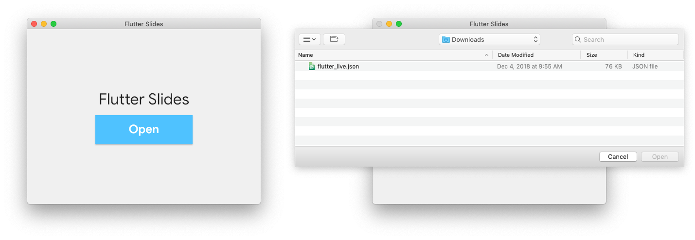 File -> Open. Your slides running in Flutter!
Lastly, we needed an easily maintainable asset and content management approach. So, we devised a JSON schema, folder structure, and file import system (hello File -> Open) to streamline the process of maintaining content.
Content Management
Anyone who has ever created a major keynote with many speakers knows that the slides are never finished until the last moment. This was a major challenge for the project. Content was created first in Google Slides, and then our team would translate it into the app.
Fortunately, we anticipated this challenge and rather than build each slide with custom slide-specific code, we devised a JSON file with a reusable slide schema. So rather than change code, we simply needed to change a single content file.
While we did occasionally have to write some new code if a slide had a new set of requirements, most slides could be laid out and populated with content simply by updating the JSON.
{ "advancement_step": 1, "type": "rect", "fill": "0xFF000000", "x": 1060.0, "y": 340.0, "height": 100.0, "width": 100.0, "animation": { "curve": "easeOut", "duration_in_milliseconds": 3000, "opacity_start": 0.0 } }While maintaining JSON comes naturally for developers, it’s not very intuitive for non-technical people. Really the JSON system is just a starting point, and in comparison to other slide products, we know the system is not perfect.
With our data structure in place, the next step would be to add an “edit” mode where we could add content boxes, add text and images, group and ungroup, reposition elements, and do the things Google Slides and Powerpoint can do. We’d love to hear ideas from the open source community for improving on this system.
It’s an App!
Of course the most exciting prospect of building a presentation as a Flutter app is that we can do anything Flutter can do. No longer does a presentation have to be limited by what Google or Microsoft or Apple have built as features for their presentation applications. We can build anything we want!
For the keynote, we wanted to ensure that we used Flutter for animations where it made sense. For complex animations, the sensible choice was to use Flare, Lottie, or animated gifs/webp. But we still wanted to demonstrate Flutter’s native animations capabilities.
So, we built a variety of transitions, carousel animations, scaling effects, and other useful (and reusable) animations.
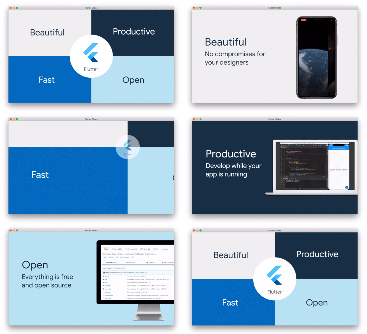 Try doing this in Powerpoint…
Perhaps the flagship animation for the presentation was the unique 4-box transition we created for Flutters “Four Pillars”. Our goal was to create a transition flow that demonstrated each pillar individually while keeping them all rooted together as a system. The final effect is simply something that is not possible in the normal presentations tools (at least not without embedded videos or incredibly advanced Powerpoint ninjas).
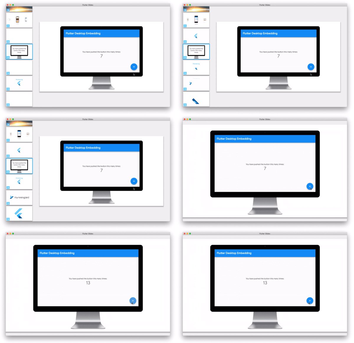 Slides that are a real Flutter app running real Flutter code
Additionally, it was crucial that we show the world that really any Flutter code can run as a desktop app. So, of course what better way to illustrate this than to show the screen every Flutter developer has seen — the starter “counter” app.
We added the real code to the application, and Tim demonstrated live during the presentation that you can tap the “+” to increment the counter.
No longer must a slideshow be limited to text, images, and videos. We can run code! Just consider the implications for technical conferences and demos during presentations. Now, instead of showing screenshots or video captures, we can embed our real code and run real apps in our slides! Amazing.
What’s Next
It was exhilarating to hear the audience’s reaction when Tim minimized the app and showed the world that he wasn’t just talking about Flutter on the desktop, he was using it for Flutter’s biggest moment.

Our team at Very Good Ventures was deeply honored to be a part of this amazing moment. This app was built very fast, with no pre-defined spec, with requirements changing to the last minute — and it accomplished its mission admirably. We couldn’t be happier.
But, we also know it could be even better.
What started as a means to make the audience’s jaw drop, is now an inspiring product in its own right. It’s still early days for Flutter Desktop Embedding and it has its limitations. We have countless ideas of how we could make it better, and we’re sure the community will as well. We can’t wait to watch it grow and see what the community can dream up.
If Flutter Live ’18 inspired you and made you excited for what Flutter can do, we hope that this app helped to demonstrate the amazing potential of Flutter on the desktop. We hope that the community will be inspired by this project — not only to keep advancing it and add more features to make an amazing presentation tool, but also to be inspired to tackle new Flutter projects on Windows and macOS.
Now, let’s see what we can make with Flutter in 2019!

