Our Blog
A Very Good Blog
Insights on Flutter, Dart, AI, and software development from the team at Very Good Ventures.
FlutterAISoftware Engineering
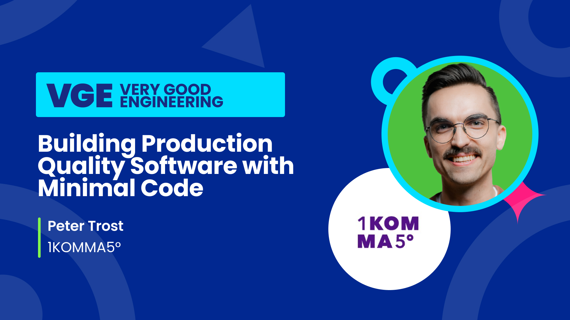
Building Production-Quality Software with Minimal Code: How a Flutter Engineer Builds with AI
VGV Team

DesignFigmaAI
Building Custom Figma Plugins: How a VGV Designer Codes with AI
VGV Team
ClaudeAnthropicCertification
Ten Days, Three Practice Runs: Passing the Claude Certified Architect Exam
John Weidner

FlutterGenuiClaude
Flutter Generative UI: Claude vs Gemini in the Same Shopping Assistant
Leandro Forte
FlutterAI
WWDC 2026, Through a Flutter Lens
Óscar Martín
GenUIAIFlutter
What Is GenUI?
VGV Team
FlutterFlutterConEnterprise
VGV at FlutterCon USA 2026: Speakers and Flutter@Scale Sessions
VGV Team
AIAI ToolingBest Practices
From draft to deck: a two-tool workflow with Claude and Claude Design
Óscar Martín

AIAgentsVery Good Engineering
Designing AI to Fail: What a Capture the Flag Game Taught Us About Where LLMs Still Break
VGV Team
Claudedynamic-workflowsmulti-agent
Claude Code Dynamic Workflows for Flutter at Scale
Jorge Coca
FlutterAICode Review
What Changes About Code Review When AI Writes Your Code
Elias Reis
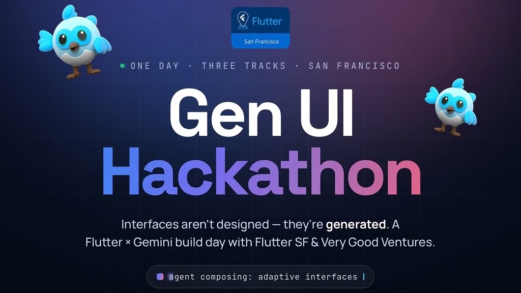
GenUIFlutterHackathon
Flutter GenUI Hackathon in San Francisco
VGV Team